Product Savings Display: How Showing Discounts in the Cart Reduces Abandonment
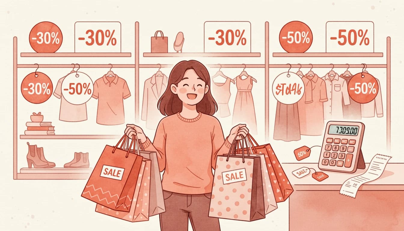
When a customer adds a discounted product to their cart, they know they're getting a deal—but do they feel it? The difference between knowing and feeling is the gap where cart abandonment lives. Research from the Baymard Institute shows that the average cart abandonment rate sits at 70.22%, with unexpected costs and price concerns among the top reasons shoppers leave without completing their purchase.
Displaying product savings directly in the cart—showing exactly how much customers save on each line item—bridges that gap. It transforms a static price into a story of value, reinforcing the customer's decision at the moment it matters most.
The Psychology Behind Visible Savings
Price perception is rarely about the actual number. It's about context, comparison, and the feeling that you're making a smart choice. This is where price anchoring becomes powerful.
When customers see a compare-at price (the original price) displayed alongside the current sale price, their brain automatically anchors to the higher number. The current price then feels like a gain rather than a cost. According to Shopify's research on psychological pricing, showing the original price crossed out next to the discounted price makes the discount seem more significant—customers perceive greater value because they're mentally comparing against the anchor.
Amazon has built its entire pricing display strategy around this principle. Every sale item shows the original price with a strikethrough, the current price, and often the percentage saved. This isn't decoration—it's conversion optimization.
Why Showing Discounts in the Cart Matters More Than Product Pages
Most merchants already show compare-at prices on their product pages. But here's what many miss: the cart is where purchase decisions crystallize.
On a product page, customers are still evaluating. They might add an item to "save for later" or compare it against alternatives. The cart is different—it's where commitment happens. And it's also where doubt creeps in.
According to Baymard Institute research, 48% of shoppers abandon their carts due to unexpected costs like shipping, taxes, and fees at checkout. When customers see their cart total without context about the savings they're receiving, that number can feel larger than expected. But when each line item shows "Save $15" or "20% off," the total transforms from a cost into a collection of smart decisions.
The psychological shift is subtle but powerful. Instead of thinking "I'm spending $120," customers think "I'm saving $45 on things I wanted anyway."
Three Types of Savings Display That Convert
Effective savings communication in the cart typically combines three elements, each serving a distinct psychological purpose.
Line-Item Savings
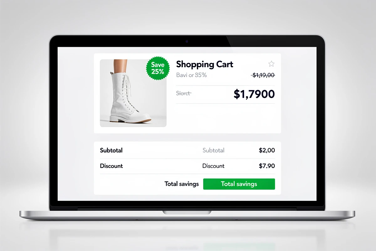
This is the most granular level: showing the savings amount for each individual product. When a customer sees "Save $12" next to a specific item, it validates that particular purchase decision. It's especially effective for higher-priced items where the absolute savings number is meaningful.
Line-item savings work best when displayed as a badge or callout that stands apart from the regular price information. The visual separation draws attention and creates a moment of positive reinforcement.
Strikethrough Compare-At Prices
The crossed-out original price creates immediate visual comparison. When customers see $75 $55, their eyes naturally track from the higher number to the lower one, experiencing the discount in real-time.
This technique leverages what behavioral economists call the "anchoring effect." The original price serves as a reference point that makes the current price feel like a better deal—even if the customer would have been happy paying that price without knowing the comparison.
For strikethrough pricing to maintain trust, the compare-at price must be genuine. Inflated or artificial "original prices" damage credibility and can create legal issues in many jurisdictions.
Total Savings Summary
While line-item savings validate individual decisions, a total savings summary in the cart footer creates a cumulative impact. Seeing "You save $67" or "Total discount: 28%" provides a powerful moment of satisfaction that carries customers through to checkout.
Smart merchants display total savings using whichever format appears more impressive. For larger carts, the absolute dollar amount often looks better ("You save $85"). For smaller purchases, the percentage might be more compelling ("You save 35%").
Implementation That Maintains Trust
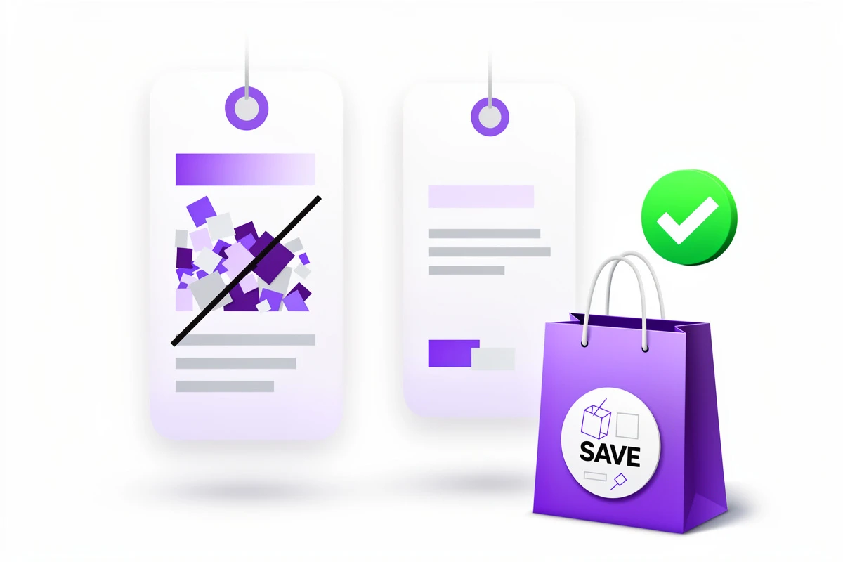
The line between effective pricing psychology and manipulative tactics is clear: transparency. Customers respond positively to savings displays when they feel informed rather than tricked.
Several principles keep savings displays trustworthy:
Use genuine compare-at prices. The original price should reflect what customers actually could have paid—a previous price, MSRP, or standard retail price. Made-up anchors destroy trust when customers discover them.
Show savings only when they exist. Products without compare-at prices shouldn't display savings information at all. Forcing every product to show some "discount" feels inauthentic.
Keep the math verifiable. If you show "Save $15," customers should be able to see the original and sale prices and verify that math themselves. Hidden calculations breed suspicion.
Match your brand aesthetic. A savings badge that looks like a flashing banner ad on an otherwise elegant site creates cognitive dissonance. The savings display should integrate naturally with your cart's design.
Design Choices That Maximize Impact

How you display savings matters as much as whether you display them. Several design decisions significantly affect performance.
Color Psychology
Green universally signals savings and money. A bright green badge with white text ("Save $20") immediately reads as positive financial information. Red can work for urgency-focused stores but carries more emotional weight. Many brands use their accent color to keep savings on-brand while still drawing attention.
Whatever color you choose, ensure sufficient contrast for readability. A savings message that's hard to read undermines its purpose.
Placement Within the Line Item
Savings information can appear inline with the price (compact and space-efficient) or on a separate row (more prominent and attention-grabbing). The choice depends on your cart's information density.
If your cart already shows product options, vendor, and properties for each item, adding inline savings might create visual clutter. A separate row gives the savings badge breathing room and ensures it doesn't get lost.
For minimal carts with just product name and price, inline savings maintain the clean aesthetic while still communicating value.
Badge vs. Text Treatment
A badge with background color creates a visual anchor that draws the eye. Text-only savings (just the color change, no background) integrates more subtly. High-emphasis brands often prefer badges; minimal brands often prefer text.
Testing both with your actual customers provides better guidance than general rules.
Measuring the Impact
Savings displays are conversion tools, and conversion improvements can be measured. Key metrics to track after implementation:
Cart-to-checkout rate: The percentage of cart viewers who proceed to checkout. Savings displays should improve this by reducing price-related hesitation. For a deeper dive into cart analytics and what metrics actually matter, tracking these specific behaviors is more valuable than general conversion rates.
Average order value: Sometimes customers who feel they're getting deals add more items. Monitor whether AOV changes.
Time in cart: A slight increase in cart viewing time, followed by higher checkout rates, suggests customers are engaging with the savings information rather than bouncing.
Abandonment exit points: If customers are abandoning at the cart stage specifically, savings displays address that pain point directly.
Common Mistakes to Avoid
Several implementation errors undermine savings displays' effectiveness.
Showing savings that are too small. "Save $0.50" on a $25 item feels insulting rather than valuable. Consider minimum thresholds for displaying savings.
Inconsistent formatting. If some products show savings as amounts and others as percentages within the same cart, the inconsistency creates confusion.
Overwhelming with numbers. Showing original price, sale price, savings amount, savings percentage, and unit price all at once creates cognitive overload. Choose the most impactful information.
Forgetting mobile. Savings badges need to remain readable on small screens. Test your implementation on actual mobile devices, not just desktop responsive mode.
Beyond Discounts: Building a Value-Forward Cart
Savings displays work best as part of a comprehensive strategy that communicates value throughout the cart experience. Consider complementary elements:
- A reward bar showing progress toward free shipping reinforces that customers are working toward additional savings
- Trust badges near the checkout button reduce payment anxiety after price concerns are addressed
- Clear discount code fields let customers who have promo codes easily apply them
Together, these elements create a cart experience that feels fair, transparent, and rewarding rather than purely transactional.
Want to highlight savings in your cart? EliteCart makes product savings visible with customizable text, colors, and placement options. Enable line-item savings through Cart Designer → Design → Product display → Product savings, and configure your total savings display in Cart Designer → Design → Cart summary → Total savings. Show strikethrough prices with a single toggle in Product display → Advanced price settings to reinforce the value your customers are getting.