Mobile Cart Optimization: Why Your Cart Experience Needs to Be Mobile-First
Here's a number worth pausing on: roughly 75% of all online retail traffic now comes from mobile devices. Your customers are browsing your store from their phones while commuting, waiting in line, and sitting on the couch. Yet most Shopify cart experiences were originally designed for desktop screens, then awkwardly squeezed down to fit a phone. That's exactly why mobile cart optimization matters — the gap between where your customers shop and how your cart performs is where revenue disappears.
Mobile cart abandonment rates sit around 85%, compared to roughly 60-67% on desktop. That 18-25 point difference represents real money your store is leaving behind. The good news is that closing this gap doesn't require a full redesign. It starts with rethinking your cart experience through a mobile-first lens.
Why Desktop-First Carts Fail on Mobile
A cart designed for a 15-inch screen simply doesn't translate to a 6-inch phone. Elements that feel spacious on desktop become cramped, and features that work with a mouse become frustrating with a thumb. Here are the most common problems:
- Too much scrolling. Desktop carts spread content across wide layouts. On mobile, that same content stacks vertically into long scrollable columns, pushing the checkout button far below the fold.
- Small tap targets. Links and buttons designed for mouse pointers are too small for thumbs. Apple's Human Interface Guidelines recommend a minimum touch target of 44x44 pixels, yet many cart elements fall short.
- Slow page loads. Cart page redirects add a full page load to the shopping flow. Research shows that 53% of mobile visitors leave if a page takes longer than 3 seconds to load.
- Cluttered layouts. Desktop carts can afford extra whitespace and side-by-side elements. On mobile, every pixel matters, and visual clutter causes cognitive overload.
Use a Mobile Cart Drawer Instead of a Cart Page
The single highest-impact change for mobile shoppers is replacing your cart page with a cart drawer. When a customer adds a product on their phone, a cart drawer slides into view without navigating away from the current page. No page load, no lost context, no waiting.
This matters more on mobile than desktop because every page redirect on a phone feels slower and more disorienting. A drawer keeps shoppers in their browsing flow, which directly reduces drop-off. Our deep dive on why cart drawers outperform cart pages covers the conversion data in detail.
With EliteCart, you can configure your Mobile cart width to either fill the entire screen for maximum space, or leave a small gap on the left side so customers can see they're in an overlay. The gap option provides a natural visual cue that tapping outside closes the cart, making navigation more intuitive on touchscreens.
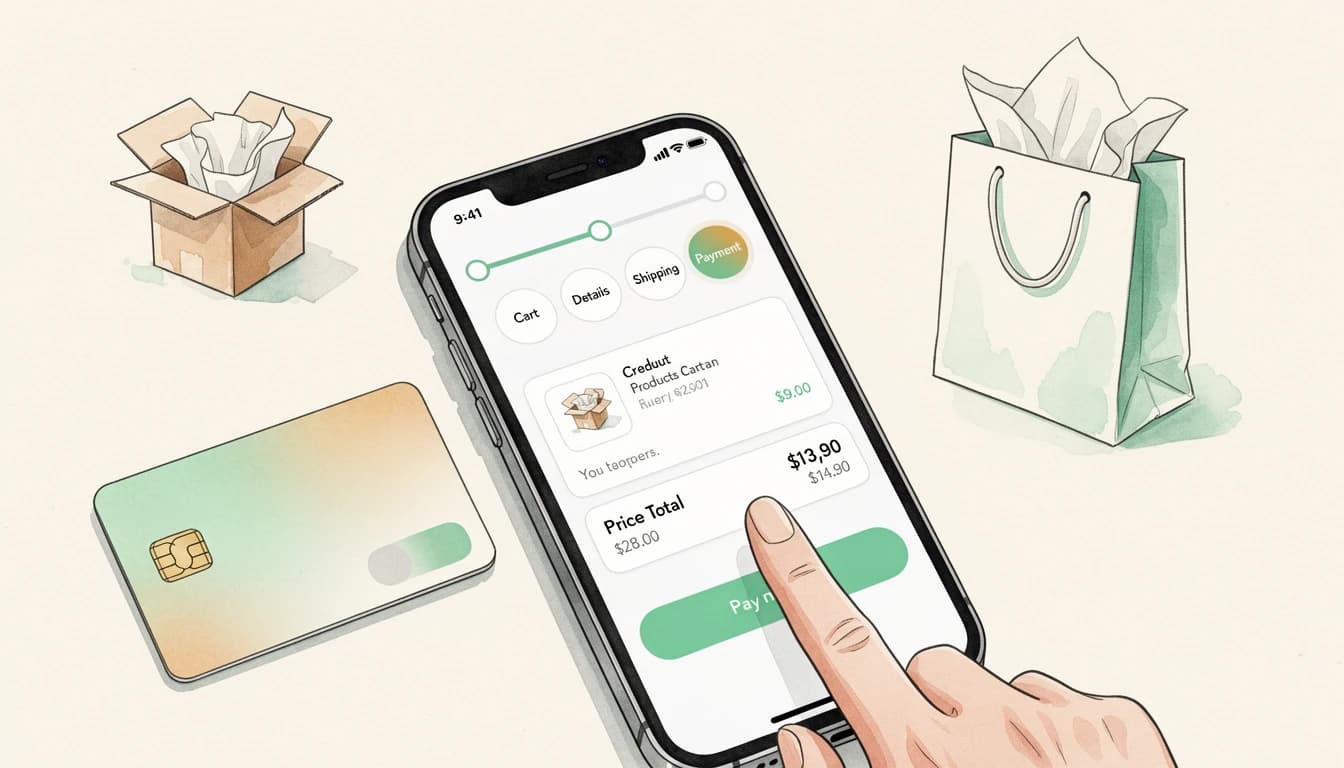
Keep the Checkout Button Visible
On mobile, anything below the fold might as well not exist. If your customer has to scroll past line items, upsells, and promotional banners just to find the checkout button, you're adding friction at the worst possible moment.
The solution is a sticky checkout area. The cart total and checkout button should remain anchored at the bottom of the screen as customers scroll through their cart contents. This ensures the primary call-to-action is always one tap away, regardless of how many items are in the cart.
EliteCart's cart layout keeps the checkout button and cart summary sticky at the bottom of the drawer on mobile, so customers never lose sight of the next step. Adding trust enhancers like payment provider logos and security badges below the checkout button reinforces confidence right at the decision point.
Make Upsells Touch-Friendly
Upselling in the cart works, but only if the experience fits a small screen. A grid of six product cards that looks great on desktop becomes a wall of tiny, untappable images on a phone.
For mobile, consider these approaches:
- Carousel layouts let customers swipe horizontally through recommendations, a gesture that feels natural on phones and takes up minimal vertical space.
- Gallery of 3 shows products in a compact grid that balances visibility with screen real estate.
- Position upsells below line items so they don't push cart contents and the checkout button out of view.
The key is reducing how much scrolling upsells add to the cart. A compact carousel that customers can swipe through takes a fraction of the vertical space compared to a stacked list. EliteCart's Smartly pre-select variants feature also helps on mobile by automatically matching variant options (like size) to what's already in the cart, eliminating extra taps.
Use Compact Announcement Banners
Announcement banners are effective for communicating shipping thresholds, flash sales, or urgency messages. But on mobile, a poorly placed banner can consume valuable screen space and push important content down.
A few principles for mobile-friendly banners:
- Use sticky positioning for urgent messages. A sticky banner at the top of the cart stays visible without taking up scrollable space.
- Keep text short. Two concise lines beat a paragraph. Mobile screens reward brevity.
- Add a countdown timer to create urgency without extra text. A simple "Order within
{countdown}for same-day shipping" communicates urgency in a single line.
EliteCart's Announcement banner supports four position options, including sticky placements that stay visible as customers scroll. You can configure separate primary and secondary text lines to create a clear visual hierarchy without overwhelming the mobile screen. For a deeper look at banner strategy, see our guide on when and how to use announcement banners in your cart.
Show a Progress Bar for Free Shipping
Unexpected costs at checkout remain the number one reason shoppers abandon carts, with 39% of shoppers citing extra costs as their reason for leaving. A free shipping progress bar solves this by showing customers exactly how close they are to qualifying, turning a potential surprise into a motivator.
On mobile, this progress bar needs to be compact and informative at a glance. Customers scrolling through their cart on a phone won't stop to read fine print about shipping thresholds. A visual bar with a clear message like "You're $12 away from free shipping" is immediate and actionable.
EliteCart's Rewards & Free Shipping bar displays a dynamic progress indicator at the top of the cart. You can configure up to three reward tiers, each with different thresholds and reward types. The bar updates in real time as customers add or remove items, giving instant feedback that encourages them to reach the next tier. We cover this in detail in how a reward bar drives higher average order values.
Reduce Steps Between Cart and Checkout
Every additional tap on mobile is a chance for the customer to reconsider, get distracted, or simply give up. The path from cart to completed purchase should be as short as possible.
Here are practical ways to shorten that path:
- Block the cart page. If you're using a cart drawer, prevent customers from navigating to the default
/cartpage. This eliminates a redundant step and ensures every customer gets your optimized mobile experience. - Enable express payment options. Apple Pay, Google Pay, and Shop Pay let customers complete purchases with a single tap or face scan. These methods bypass the traditional checkout form entirely.
- Show savings in the cart. Displaying compare-at prices and total savings directly in the cart reassures customers about the value of their purchase before they even reach checkout.

Test on Real Devices
This sounds obvious, but most merchants only preview their cart on desktop browsers. Even responsive design tools in Chrome don't fully replicate the experience of using your cart on an actual phone.
Test these specific interactions on a real mobile device:
- Add a product and open the cart. Does it feel instant? Is the animation smooth?
- Scroll through the cart. Can you reach the checkout button without excessive scrolling?
- Tap the upsell buttons. Are they easy to hit with your thumb? Do they respond on the first tap?
- Read the banner text. Is it legible without squinting? Does it take up too much space?
- Complete the checkout flow. Time yourself from cart open to order placed. Every second counts.
If any of these interactions feel slow, awkward, or frustrating, your customers feel the same way. They're just less patient about it.
Mobile Cart Optimization Is Revenue Optimization
With three-quarters of your traffic coming from phones, mobile cart optimization isn't a nice-to-have. It's where the majority of your conversion opportunities live. The stores that treat mobile as the primary experience, not an afterthought, are the ones capturing revenue that competitors leave on the table.
Start with the changes that have the biggest impact: switch to a cart drawer, keep your checkout button visible, and make sure upsells are swipeable rather than scrollable. Then refine from there based on what you see on your own phone.
Your mobile cart should work as well as your best-performing product page. Small improvements in mobile cart experience compound across every session, every day, across your entire customer base.