Different Recommendations for Cart, Product Page, and Checkout
Most stores run a single recommendation strategy and paste it onto every surface: the same logic on the product page, in the cart, and at checkout. It feels efficient, but it ignores a basic truth about how people shop. A visitor browsing a product page is in a completely different headspace than someone with their card out at checkout. The cart vs product page recommendations question is not about which engine is better. It is about matching what you suggest to what the shopper is actually trying to do at that exact moment.
When you treat all three surfaces the same, you waste your highest-intent placements. You show broad "you might also like" picks to someone who has already decided to buy, and you push narrow add-ons to someone who is still exploring. Both miss. This guide breaks down the intent behind each surface and gives you a practical playbook for mapping a recommendation strategy to each one.
Why cart vs product page recommendations is the wrong place to stop
Plenty of merchants split their thinking into "product page" and "cart" and call it a day. That is a good start, but checkout is a third surface with its own rules, and ignoring it leaves money on the table. The full journey has three distinct moments of intent:
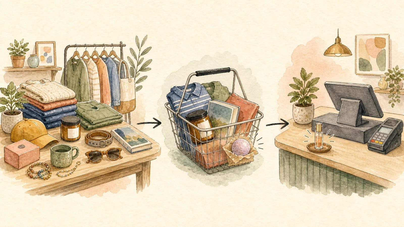
- Product page: the shopper is still deciding. Intent is low to medium. They are open to discovery and exploration.
- Cart: the shopper has committed to at least one item. Intent is high. They are mentally preparing to pay.
- Checkout: the shopper has their payment details out. Intent is at its peak, but so is their sensitivity to anything that slows them down.
Each moment rewards a different kind of suggestion. The same product that converts beautifully on a product page can feel like an obstacle at checkout. Your job is to read the moment and match the offer to it.
The product page: discovery and exploration
On a product page, the shopper is gathering information. They might love the item in front of them, or they might bounce in ten seconds. This is the moment to broaden their interest, not narrow it.
Good product page recommendations widen the consideration set. If someone is looking at a running shoe, show them other shoes, a different colorway, or a related category like performance socks and apparel. You are helping them explore the catalog and find the thing they did not know they wanted. Cross-category suggestions shine here because the shopper has not committed to anything yet, so a tangential idea is welcome rather than distracting.
The goal on this surface is engagement and deeper browsing, which feeds everything downstream. A shopper who explores three products and adds one to the cart is far more valuable than one who saw a single page and left. For more on shaping what appears here, see our guide to merchandising rules for product recommendations.
The cart: complete the purchase and lift order value
Once an item is in the cart, the shopper's mindset flips. They are no longer asking "do I want this?" They are asking "am I ready to check out?" This is the prime spot for complements: the things that go with what they already chose.
Cart recommendations should answer "what completes this purchase?" If the cart holds a camera, suggest the memory card, the case, or a spare battery. These are frequently-bought-together add-ons that feel like a natural extension of the decision the shopper already made. They also do the real work of raising average order value, because the shopper is past the commitment hurdle and a small relevant add-on is an easy yes.
Keep the add-ons genuinely complementary and reasonably priced relative to the cart. A $300 accessory next to a $40 item reads as a distraction, not a helpful nudge. Modest, obvious complements convert; ambitious cross-sells stall. To decide whether a slot should round out the basket or trade the shopper up, our guide to cross-sell vs upsell breaks down each motion, and price-aware product recommendations covers how to keep suggested prices in a sensible band.
The checkout: low-friction, low-cost impulse
Checkout is the most delicate surface of all. The shopper has their wallet open and is seconds from converting. Anything that makes them stop, reconsider, or rebuild their decision is a threat to the sale you have already half-won.
This is the place for the impulse rack. Think of the candy and magazines by a grocery register: cheap, fast, no thinking required. A small, low-cost, high-margin add-on that someone can toss in without re-evaluating their whole order is ideal. A gift wrap option, a small consumable, a low-priced accessory. The test is simple: would adding this item make the shopper pause? If yes, it does not belong at checkout.
Resist the urge to show big-ticket cross-sells here. A pricey suggestion at checkout forces a fresh decision at the exact moment you want frictionless momentum, and the most common outcome is not a bigger order but an abandoned one. Cheap and effortless wins at checkout. Save the ambitious recommendations for earlier in the journey.
A per-surface playbook in practice
Here is how the three surfaces map to intent and offer type:
- Product page - intent: exploring. Offer: cross-category complements, alternatives, broadening picks. Goal: discovery.
- Cart - intent: committing. Offer: frequently-bought-together complements, modest add-ons. Goal: complete the purchase and lift order value.
- Checkout - intent: paying. Offer: cheap, fast, high-margin impulse items. Goal: a quick yes with zero friction.
The point is not to run three unrelated systems. It is to run one engine, tuned three ways, so each placement plays to the intent in front of it.
How to run different strategies per surface in EliteCart
This is exactly what the Fine-tune EliteAI™ Ultra feature is built for. Each fine-tuned version you save becomes a selectable recommendation source that you can assign independently to the cart, the product page, the two-step cart, and each checkout module. Different surfaces can run different versions at the same time, and you can keep up to three live versions per shop, so a discovery version, an add-on version, and a checkout version can all run at once.
Each version starts from a base that you match to the surface's intent:
- EliteAI™ Ultra Original leans on frequently-bought-together patterns, which makes it a strong fit for cart add-ons.
- CrossCategoryBoost surfaces cross-category complements, which is what you want for product page discovery.
From there you shape each version with Filters, which are hard rules about what is eligible, and Boosts, which softly nudge the ranking on a five-way scale. For your checkout version, a price filter capped to inexpensive products gives you that impulse-rack behavior automatically. Every version trains on your own store's orders and catalog, so the suggestions reflect how your shoppers actually buy.
To set this up, see the Help Center guide on fine-tuning EliteAI™ Ultra and the background on how EliteAI™ works. For the announcement and a feature walkthrough, read our fine-tuning update.
Start with intent, not convenience. Map each surface to what the shopper is trying to do, give each placement its own tuned version, and stop letting one identical strategy underperform on three very different stages of the journey.